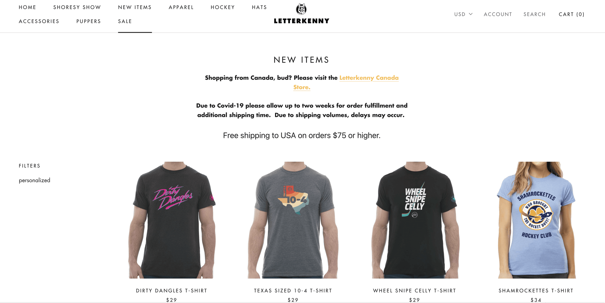
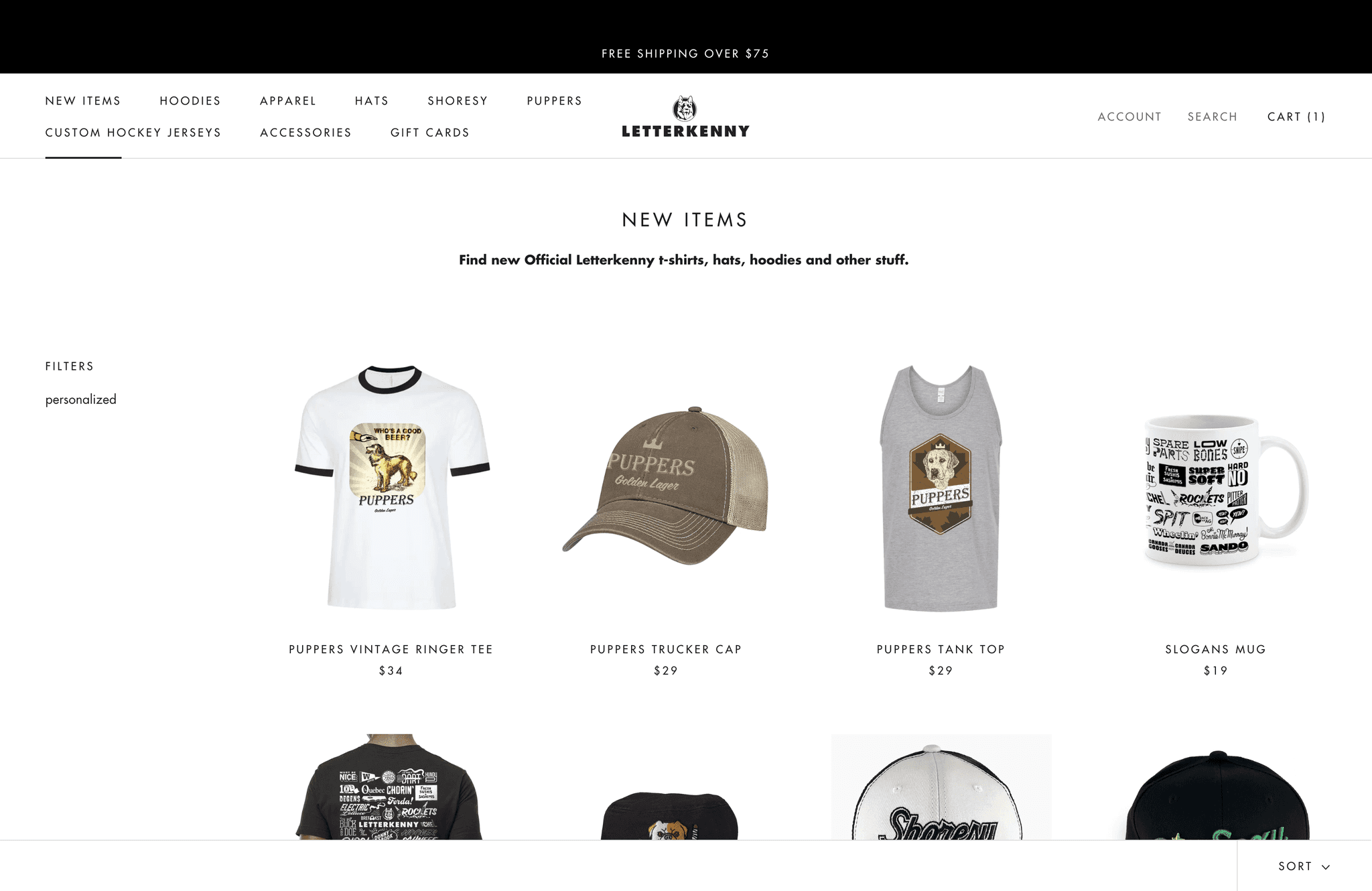
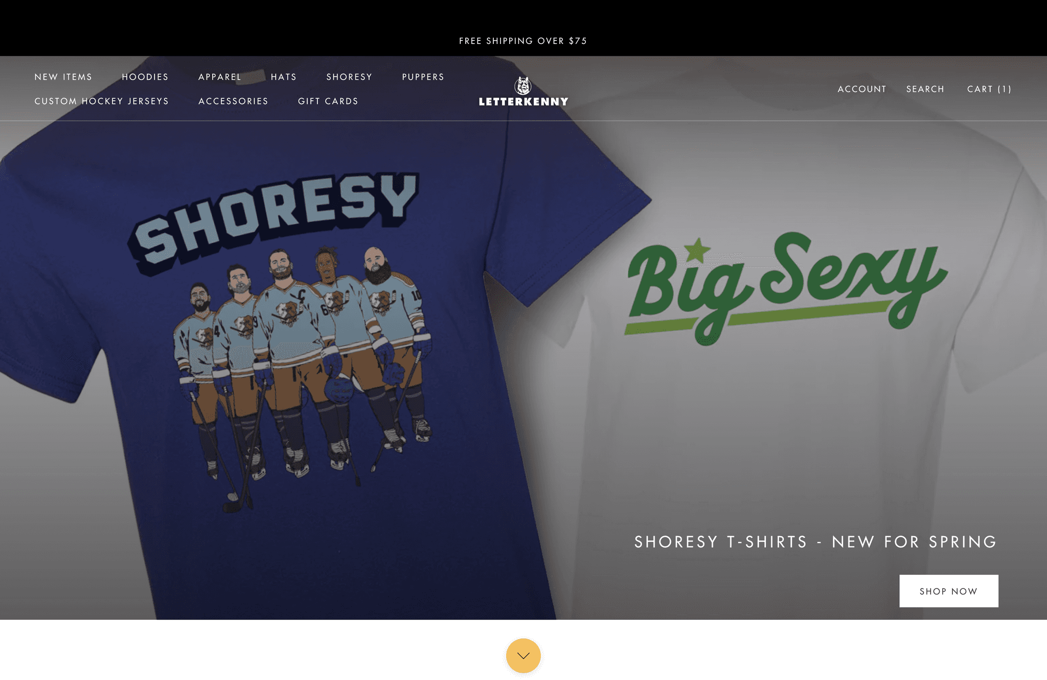
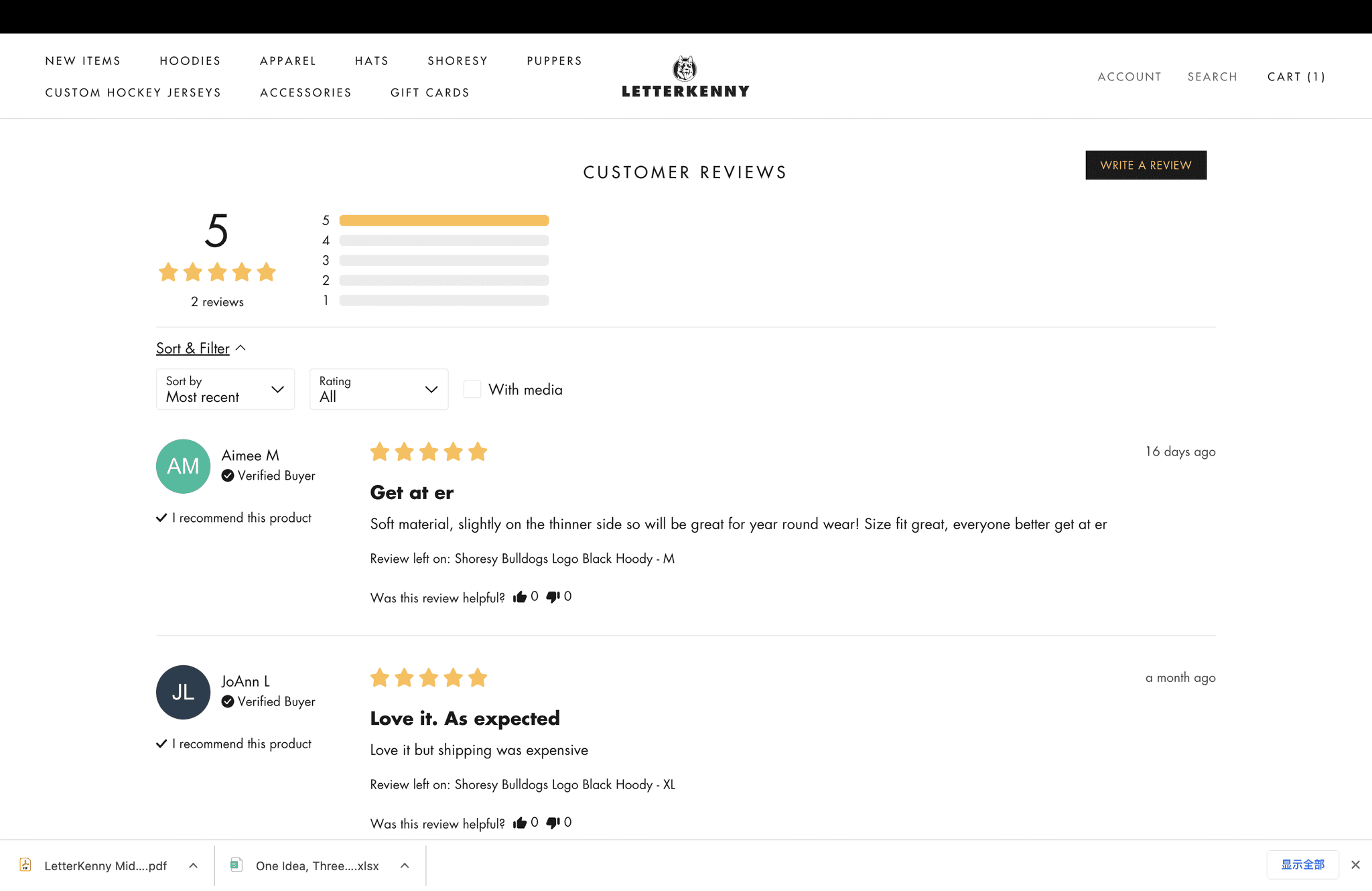
Outcomes
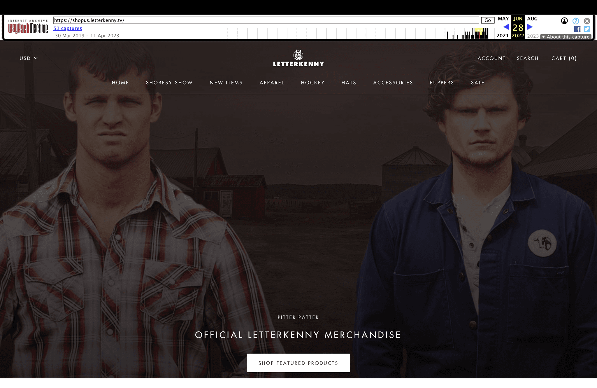
The outcome of the project is a redesigned Letterkenny merchandise website that successfully promotes
the merchandise and improves the user experience, leading to increased profitability and customer
satisfaction. The website will effectively differentiate itself from third-party websites by prominently
displaying official branding and clear messaging that communicates the authenticity of the merchandise.
Through an engaging and visually appealing merchandising display, users will be able to easily browse
and purchase a wide range of Letterkenny products, including clothing, accessories, and collectibles.
The website will address the pain points of user trust and authenticity by implementing trust signals,
detailed product descriptions, and high-quality imagery. Overall, the outcome will be an immersive user
experience that instills trust, showcases the authenticity of the website, and provides a seamless
purchasing journey for fans of Letterkenny.
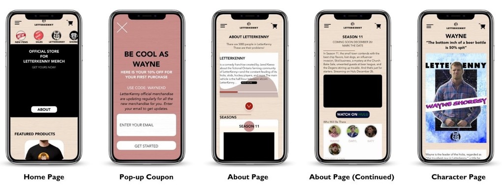
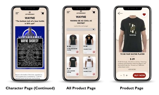
Moile Version:
Deliverables
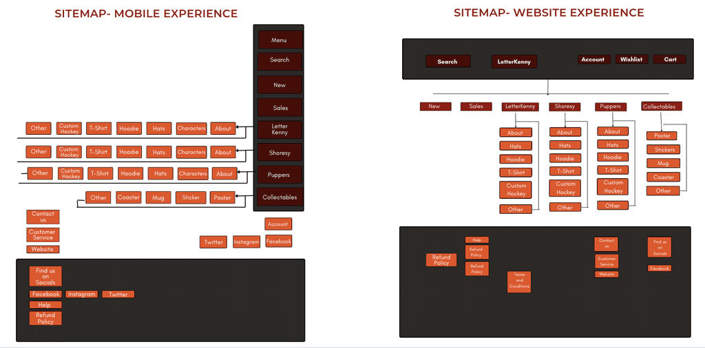
Information Architecture
Painpoint
Lack of Differentiation, Users find it difficult to distinguish between the official Letterkenny website and
third-party websites that sell unofficial merchandise. This creates confusion and uncertainty about the
authenticity and quality of the products they are purchasing.
Abandoned Carts, Users may face obstacles or encounter issues during the checkout process, leading
to abandoned carts. This could be due to complicated or lengthy checkout procedures, unexpected
additional costs, lack of payment options, or concerns about security.
Goals
To solve these pain points while creating an immersive experience for users, I set the following goals:
Clear branding and messaging, emphasize the website's official branding throughout the design and
content. Use prominent visual cues and clear messaging to communicate the item’s authenticity and
differentiate it from third-party sources. This may include official logos, trademarks and clear
statements about official licenses.
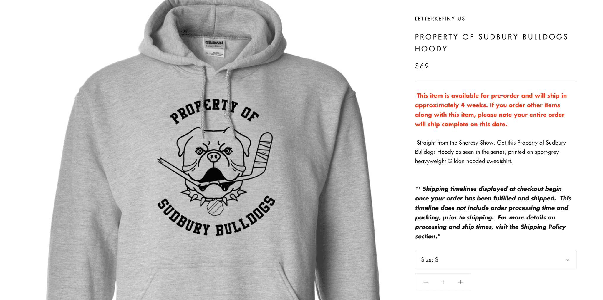
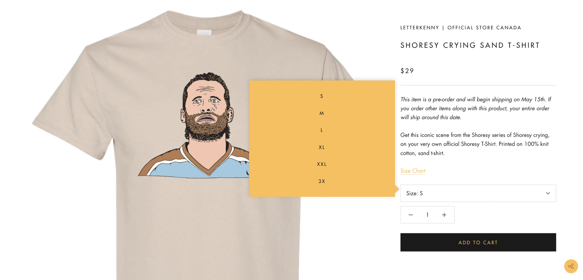
Detailed Product Descriptions and Images, provides comprehensive and accurate product descriptions,
including details on materials, dimensions and official licenses. Give users a clear idea of what they're
buying by using high-quality images that show your product from different angles.
Simplified Checkout Process, optimize the checkout process to make it as simple, intuitive and
streamlined as possible. Minimize the number of steps required, provide guests with checkout
options, offer multiple payment methods, and clearly display any additional costs (e.g. taxes,
shipping) up front.
Personalized recommendations and offers, use user data and browsing behavior to provide
personalized product recommendations and targeted offers. This helps motivate users to
complete purchases and reduces cart abandonment rates.
Key Points from Research:
The inability to differentiate between third-party websites: this affects sales and creates a significant loss in
revenue for the company. By eliminating the sales that the original website should be making and misleading
users into purchasing unofficial products.
Abandoned carts are also a major issue during the user's process of purchasing the merchandise.
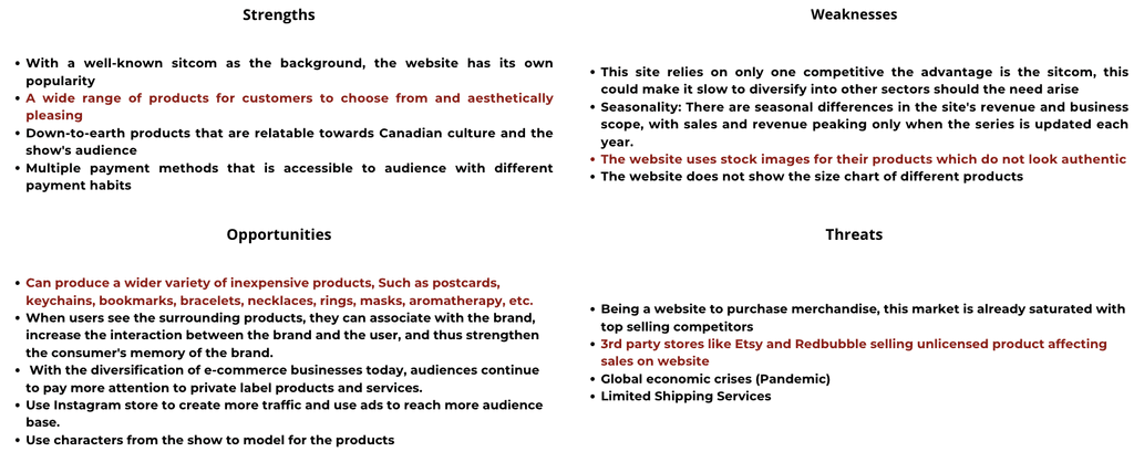
My goal was to design the mobile app for Letterkenny's store and redesign the Letterkenny website with a clear
focus on promoting merchandise and improving the user experience to increase the profitability of the letterkenny
store. By improving the merch display, I worked hard to create an engaging and visually appealing platform
where fans can easily browse and purchase merchandise related to the show.
Before the project officially started, we completed Content Audit, Current State Analysis, Competitive Analysis.
Then we did a SWOT analysis:
Objective
Research
Overview
Letterkenny merchandise, such as clothing, accessories, and collectibles, can be found on the official Letterkenny
website, as well as popular e-commerce platforms like Amazon and the Comedy Network's online store. Fans can
purchase items like t-shirts, hoodies, hats, mugs, posters, and more, featuring quotes, images, and references
from the show, allowing them to express their love for Letterkenny through tangible merchandise.
There are many Letterkenny Merchandise websites and users can’t differentiate between the authentic
merchandise website and the 3rd party websites, more so our client has an abandoned cart issue.
So how might we create an immersive experience for the user while communicating the authenticity of the
website and providing a solution for the abandoned cart issue.
Problem
Redesign LetterKenny's E-Store
Project Name:
LetterKenny E-Store
Provided by:
Wenxiao Zheng
Wilson Fung
Babak Jahedi
Timeline:
Sep 2022 - Dec 2022
Tools Used:
Adobe XD/PS
Miro
Canva
Type of Project:
Mobile Application
Website
My Role:
User Research
UI/UX
Prototyping
